On Data Visualization in R
Helpful references for the session
- Bjørnstad, O. N. (2018). Epidemics, models and data using R. https://doi.org/10.1007/978-3-319-97487-3
- The Epidemiologist R Handbook. https://epirhandbook.com/en/
- More information about ggplot https://ggplot2.tidyverse.org/index.html
Introduction
Data visualization in broader context simplifies complex information, making it easier to understand and communicate. Effective visualizations empower data analyst to make data driven decisions and convey insights to stakeholders. Visualizations highlight patterns, trends, and outliers, enabling deeper exploration of data. Clear and accurate visualizations enhance the effectiveness of presentations and reports. Visualizations foster engagement and understanding among stakeholders, promoting collaboration and informed decision making.
a) Principles of effective data visualization
In order to achieve the intended purpose of data visualization, it is important to adhere to the following principles of visualization;-
- Clarity:
– Simplify complex data by removing unnecessary elements and reducing clutter.
– Use clear and concise labels, titles, and annotations to provide context and aid interpretation.
– Highlight the main message or insights by emphasizing relevant elements in the visualization.
– Ensure that the visualization is intuitive and easy to understand for the target audience.
– Avoid visual distortions that may misrepresent the data or lead to incorrect interpretations.
- Accuracy:
– Represent data accurately without distorting information or misinterpreting trends.
– Use appropriate scales, axes, and legends to ensure faithful representation of the data.
– Clearly state any transformations or data manipulations applied to the visualization.
– Provide relevant statistical measures or confidence intervals to support the data representation.
– Validate the visualization against the underlying data to ensure consistency and accuracy.
- Consistency:
– Use consistent scales, labels, and formats across multiple visualizations to facilitate comparison.
– Apply consistent color schemes or palettes to represent similar data categories consistently.
– Maintain consistent visual styles and design elements across different parts of the visualization.
– Ensure that the visualization adheres to organizational branding guidelines, if applicable.
– Consistency promotes clarity, reduces cognitive load, and improves overall understanding.
- Relevance:
– Focus on presenting the most relevant insights and patterns in the data.
– Identify the key questions or objectives and design visualizations that address them.
– Prioritize the information that is crucial for decision making and remove unnecessary details.
– Tailor the visualization to the specific needs and interests of the target audience.
– Use appropriate visual encodings and interactions to highlight relevant aspects of the data.
There are other data visualization functions in R for example qplot but for this presentation we use a package known as ggplot.
ggplot2 is a widely used data visualization package in R, known for its flexibility and versatility. The grammar based approach of ggplot2 allows users to construct visualizations using a series of layered components. ggplot2 provides a wide range of aesthetically pleasing and customizable plot types. The package follows the “grammar of graphics” philosophy, enabling users to express complex visualizations concisely.
ggplot2 benefits from a wide variety of supplementary R packages that further enhance its functionality.
The syntax is significantly different from base R plotting, and has a learning curve associated with it. Using ggplot2 generally requires the user to format their data in a way that is highly tidyverse compatible, which ultimately makes using these packages together very effective.
b) Building blocks of ggplot
The package ggplot building is a layered visualization within the grammar of graphics that includes
- Data: The element is the data set itself.
- Aesthetics: The data is to map onto the Aesthetics attributes such as x-axis, y-axis, color, fill, size, labels, alpha, shape, line width, line type.
- Geometrics: How our data being displayed using point, line, histogram, bar, boxplot.
- Facets: It displays the subset of the data using Columns and rows.
- Statistics: Binning, smoothing, descriptive, intermediate.
- Coordinates: the space between data and display using Cartesian, fixed, polar, limits.
- Themes: Non-data link.
There a number of types of visualizations in ggplot that are commonly used for example:-
–Scatter plots: Display the relationship between two continuous variables by plotting points on a Cartesian plane. Use different colors, shapes, or sizes to represent additional categorical variables.
–Bar plots: Compare categorical variables and their frequencies using rectangular bars. Group the bars by different categories to analyze distributions or make comparisons.
–Line plots: Show trends or patterns over time or continuous variables using connected line segments. Identify temporal changes in HIV prevalence, incidence, or treatment outcomes.
–Box plots: Visualize the distribution of a continuous variable using quartiles and outliers. Identify central tendencies, variations, and skewness in related measurements.
–Histograms: Illustrate the frequency distribution of a continuous variable using bars of varying heights. Identify data skewness, modes, or gaps in measurements.
We revisit some of the concepts already covered in previous sessions and use a dataset provide to create visualizations with an aim of understanding the trends from the data.
1. Load packages
Download the full script HERE!
This code chunk shows the loading of packages required for the data visualization.
pacman::p_load(

tidyverse,      # includes ggplot2 and other data management tools

janitor,        # cleaning and summary tables

ggforce,        # ggplot extras

rio,            # import/export

readxl.         # read excel files

)

## Warning: package 'readxl.' is not available for this version of R

##

## A version of this package for your version of R might be available elsewhere,

## see the ideas at

## https://cran.r-project.org/doc/manuals/r-patched/R-admin.html#Installing-packages

## Warning: 'BiocManager' not available.  Could not check Bioconductor.

##

## Please use `install.packages('BiocManager')` and then retry.

## Warning in p_install(package, character.only = TRUE, ...):

## Warning in library(package, lib.loc = lib.loc, character.only = TRUE,

## logical.return = TRUE, : there is no package called 'readxl.'

## Warning in pacman::p_load(tidyverse, janitor, ggforce, rio, readxl.): Failed to install/load:

## readxl.
2. Import data
We import the dataset of HIV cases recorder at a health center. We can use rio package of readxl to read the example data which is included in this folder if not, the whole path to the location of the dataset must be given. The dataset is an Excel file (.xlsx). The following chuck is used to import the data.
Note: Please download the dataset HERE and save it in your working directory.
hiv_data <- rio::import("hivdata.xlsx")

head(hiv_data,n=10) # to view the first 10 rows of the data

##    id age gender hiv CD4  VL

## 1   1  49      1   0  NA  NA

## 2   2  26      1   0  NA  NA

## 3   3  21      2   0  NA  NA

## 4   4  24      1   0  NA  NA

## 5   5   1      2   0  NA  NA

## 6   6   3      2   0  NA  NA

## 7   7  17      1   0  NA  NA

## 8   8  83      2   0  NA  NA

## 9   9  28      2   0  NA  NA

## 10 10  28      2   1 643 790
3. Cleaning the data
We can prepare our data to make it better for plotting which can include making the contents of the data better for display. This is a key step for the following reasons:-
- Clean the data by removing duplicate entries, handling missing values, and correcting errors.
- Filter the data to focus on relevant subsets or time periods for specific analyses.
- Transform variables if necessary, such as converting categorical variables into factors or creating derived variables.
- Validate the data quality and ensure the accuracy and consistency of the variables used in visualizations.
In this dataset, we can transform the variables gender and status. This can be achieved by
hiv_data$hiv.cat <- NA
# creates an empty column called hiv.cat

hiv_data$hiv.cat[hiv_data$hiv==0] <- "Negative"
# hiv.cat is updated with "Negative" if it is 0

hiv_data$hiv.cat[hiv_data$hiv==1] <- "Positive"
# hiv.cat is updated with "Positive" if it is 1

hiv_data$hiv.gender <- NA
# creates an empty column called hiv.gender

hiv_data$hiv.gender[hiv_data$gender==1] <- "Female"
# hiv.gender is updated with "Female" if it is 1

hiv_data$hiv.gender[hiv_data$gender==2] <- "Male"
# hiv.gender is updated with "Male" if it is 2

view(hiv_data)
We can also create categories for the ages recorded at the health center. For this purpose we can use the cut() function in base R.hiv_data["age.cat"] <- cut(hiv_data$age,c(0,14,24,49,60,Inf),
c("0-14","15-24","25-49","50-59","60+"),
include.lowest = TRUE)
4. On actual plotting using ggplot
Plotting with ggplot2 is based on “adding” plot layers and design elements on top of one another, with each command added to the previous ones with a plus symbol (+). The result is a multi-layer plot object that can be saved, modified, printed, exported, etc.
ggplot objects can be highly complex, but the basic order of layers will usually look like this:
– Begin with the baseline ggplot() command – this “opens” the ggplot and allow subsequent functions to be added with +. Typically the dataset is also specified in this command.
– Add “geom” layers – these functions visualize the data as geometries (shapes), e.g. as a bar graph, line plot, scatter plot, histogram (or a combination!). These functions all start with geom_ as a prefix.
– Add design elements to the plot such as axis labels, title, fonts, sizes, color schemes, legends, or axes rotation.
A simple example of skeleton code is as follows. We will explain each component in the sections below.
# plot data from my_data columns as red points
ggplot(data = my_data)+                   # use the dataset "my_data"
  geom_point(                             # add a layer of points (dots)
    mapping = aes(x = col1, y = col2),    # "map" data column to axes
    color = "red")+                       # other specification for the geom
  labs()+                                 # here you add titles, axes labels, etc.
  theme()                                 # here you adjust color, font, size etc of non-data plot elements (axes, title, etc.)
a) ggplot()
The opening command of any ggplot2 plot is ggplot(). This command simply creates a blank canvas upon which to add layers. It “opens” the way for further layers to be added with a + symbol.
Typically, the command ggplot() includes the data= argument for the plot. This sets the default dataset to be used for subsequent layers of the plot.
This command will end with a + after its closing parentheses. This leaves the command “open”. The ggplot will only execute/appear when the full command includes a final layer without a + at the end.
# This will create plot that is a blank canvas
ggplot(data = hiv_data)
(b) Geoms
We now need to create geometries(shapes) from our data which can include bar plots, histograms, scatter plots, box plots, time series plots etc.
This is done by adding layers “geoms” to the canvas created in (a). Each of the functions begins with “geom_”, and the in general geom_XXXXX().
There are over 40 geoms in ggplot2. See https://exts.ggplot2.tidyverse.org/gallery/ for more.
The common ones are:
– Histograms – geom_histogram()
– Bar charts – geom_bar() or geom_col()
– Box plots – geom_boxplot()
– Points – geom_point()
– Line graphs – geom_line() or geom_path()
– Trend lines- geom_smooth()
NOTE: In one plot you can display one or mutiple geoms, each added to the previous by “+”.
(c) Mapping the data to the plot
We need now to map (assign) columns in the data to components of the plot like the axes, shape colors, shape sizes, etc.
This is achieved by the mapping= argument. The mappings provided must be wrapped in the aes() function. So we write something like
mapping = aes(x = col1, y = col2)Below we can try some plots using ggplot2 and using the HIV data provided and build on this to create more complex plots in latter sessions.
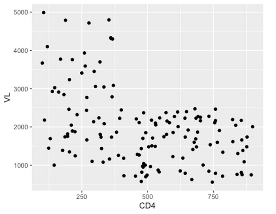
(i) Scatter plots
ggplot(data = hiv_data, mapping= aes(x = CD4, y = VL)) +
  geom_point()
## Warning: Removed 1357 rows containing missing values or values outside the scale ## range
## (`geom_point()`).
(ii) Box plots
ggplot(data = hiv_data, mapping = aes(x = hiv.gender, y = CD4)) +
  geom_boxplot()
## Warning: Removed 1357 rows containing non-finite outside the scale range
## (`stat_boxplot()`).

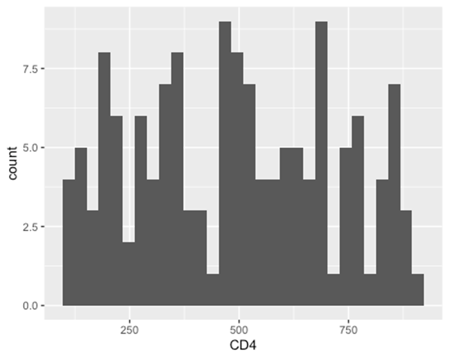
(iii) Histograms
ggplot(data = hiv_data, mapping = aes(x = CD4)) +
  geom_histogram()
## `stat_bin()` using `bins = 30`. Pick better value with `binwidth`.
## Warning: Removed 1357 rows containing non-finite outside the scale range
## (`stat_bin()`).
(d) Plot aesthetics
In ggplot the term “aesthetic” refers to the visual property of the plotted data that is the data being plotted in geoms/shapes and not the sorrounding display such as titles,axes, background color. In ggplot those details are called “themes” and are adjusted within a theme().
Hence the plot object aesthetics can be colors,sizes,transperancies, placement etc of the plotted data.
Some of the options of most geoms (not all have the same aesthetic options) include
– shape = -Display a point with geom_point() as a dot, star, triangle or square
– fill = – The interior color (e.g. of a bar or boxplot).
– color = – The exterior line of a bar, boxplot, etc ot the point color if using geom_point()
– size = – Size (e.g. line thickness, point size)
– alpha = – Transperency (1= opaque, 0= invisible)
– binwidth = – Width of the histogram bins
– width = – Width of “bar plot” columns
– linetype = – Line type (e.g. solid dashed,dotted)
These plot object aesthetics can be assigned values in two ways:
– Assigned a static value (e.g. color = “blue”) to apply across all plotted observations.
– Assigned to a column of the data (e.g. color = hiv.gender ) such that display of each observation depends on its valus in that column.
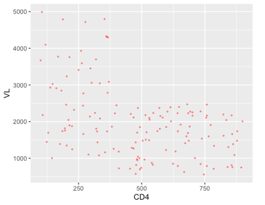
(i) Setting to a static value
If you want the plot object aesthetic to be static, that is – to be the same for every observation in the data, you write its assignment within the geom but outside of any mapping = aes() statement. These assignments could look like size = 1 or color = “blue”. Here are two examples:
ggplot(data = hiv_data, mapping= aes(x = CD4, y = VL)) +
  geom_point(color = "red", size = 0.6, alpha = 0.4)
## Warning: Removed 1357 rows containing missing values or values outside the scale range
## (`geom_point()`).
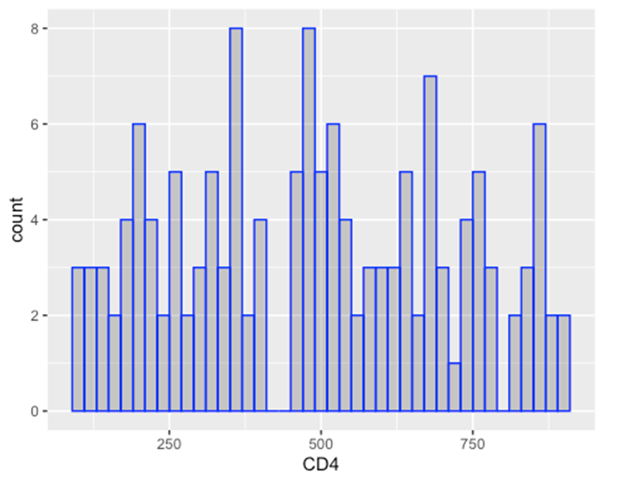
ggplot(data = hiv_data, mapping = aes(x = CD4)) +
  geom_histogram(
    binwidth = 20,
    color = "blue",
    fill = "black",
    alpha = 0.2
  )
## Warning: Removed 1357 rows containing non-finite outside the scale range
## (`stat_bin()`).
(ii) Scaled to column values
In this approach, the display of this aesthetic will depend on that observation’s value in that column of the data. If the column values are continuous, the display scale (legend) for that aesthetic will be continuous. If the column values are discrete, the legend will display each value and the plotted data will appear as distinctly “grouped”.
In the examples below this is shown.
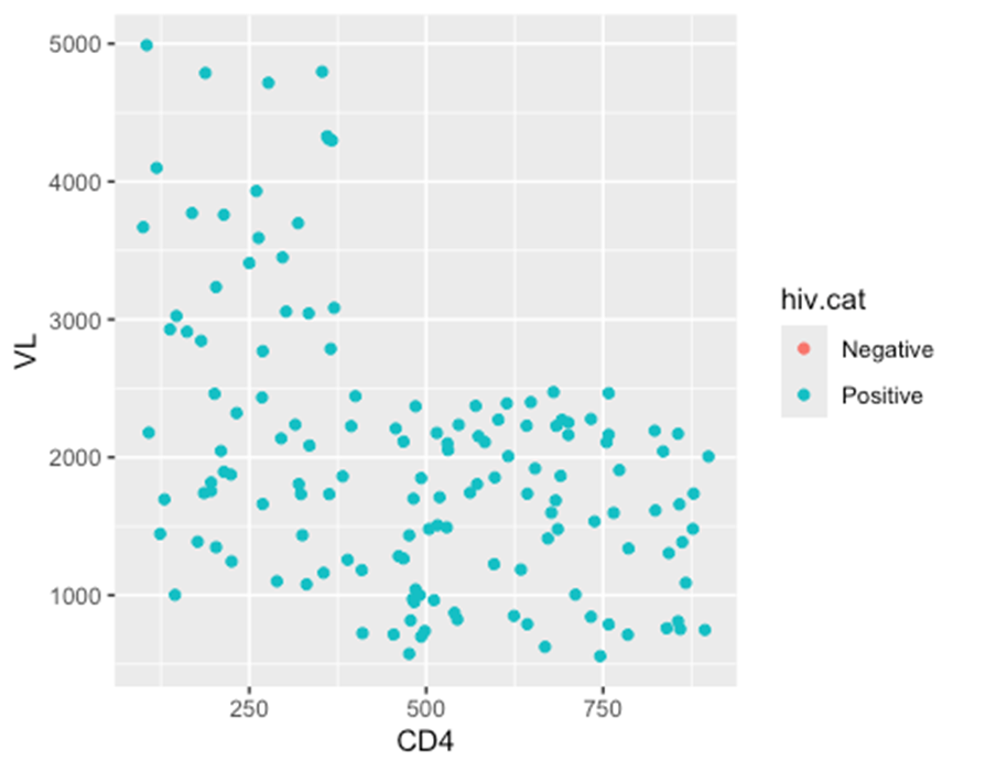
– In the first example, ** the color =** aesthetic (of each point) is mapped to the column HIV category – and a scale has appeared in a legend.
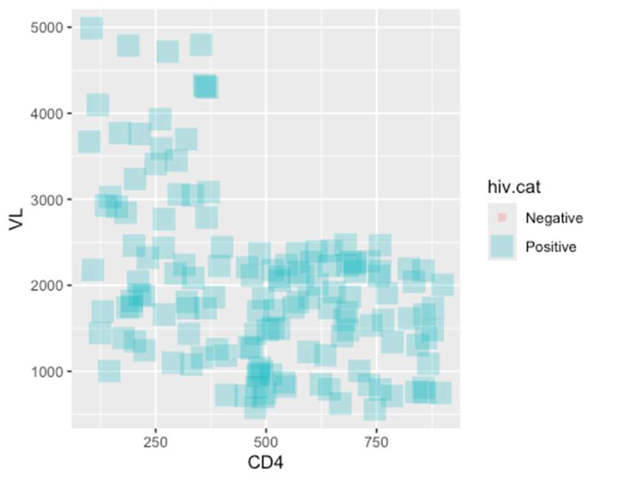
– In the second example two new plot aesthetics are also mapped to columns (color = and size =), while the plot aesthetics shape = and alpha = are mapped to static values outside of any mapping = aes() function.
ggplot(data = hiv_data, mapping = aes(x = CD4, y = VL, color = hiv.cat)) +
  geom_point()
## Warning: Removed 1357 rows containing missing values or values outside the scale range
## (`geom_point()`).
ggplot(data = hiv_data, mapping = aes(x = CD4, y = VL, color = hiv.cat, size = hiv.cat)) +
  geom_point(
    shape = "square",
    alpha = 0.3
  )
## Warning: Using size for a discrete variable is not advised.
## Warning: Removed 1357 rows containing missing values or values outside the scale range
## (`geom_point()`).
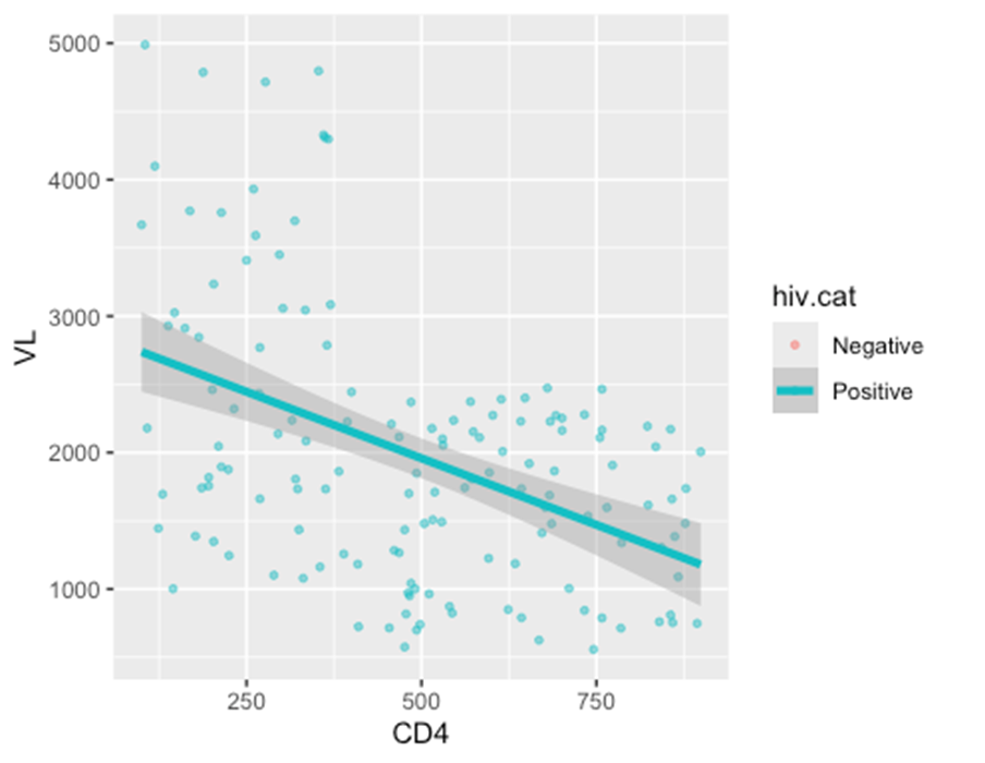
ggplot(data = hiv_data, mapping = aes(x = CD4, y = VL, color = hiv.cat)) +
  geom_point(
    size = 1,
    alpha = 0.5)+
  geom_smooth(
    method = "lm",
    size = 1.5
  )
## Warning: Using `size` aesthetic for lines was deprecated in ggplot2 3.4.0.
## ℹ Please use `linewidth` instead.
## This warning is displayed once every 8 hours.
## Call `lifecycle::last_lifecycle_warnings()` to see where this warning was
## generated.
## `geom_smooth()` using formula = 'y ~ x'
## Warning: Removed 1357 rows containing non-finite outside the scale range
## (`stat_smooth()`).
## Warning: Removed 1357 rows containing missing values or values outside the scale range
## (`geom_point()`).
NOTE: Axes assignments are always assigned to columns in the data (not to static values), and this is always done within mapping = aes().


Responses