Intro to R in Epidemiology (Part 2 – Continued!)
Basic data manipulation using the tidyverse
There are many useful functions within the tidyverse package that allow for data manipulation. Some of these are more commonly used than others, like mutate(), select() and filter(), for example.
Several of these functions may be strung together using the pipe operator, as shown in the example below.
Today’s cript can be downloaded HERE!
And, you can also download the demo dataset HERE!
Remember to join our R For Fun Community to learn R with others. Joining and participating is FREE!
# SOME BASIC DATA MANIPULATION USING TIDYVERSE

# load required packages

# if you have already installed the 'pacman' package, skip the installation
# and just load the package

install.packages('pacman')

# load packman

pacman::p_load(rio,
               here,
               janitor,
               tidyverse)

# import data

linelist_raw <- import('https://afredac.net/wp-content/uploads/2024/04/linelist_raw.xlsx')


# begin cleaning piple chain

##############################
linelist <- linelist_raw %>%
  # standardize column name syntax
  janitor::clean_names()%>%

  # manually re-name columns
  # NEW name                     #OLD name
  rename(date_infection         = infection_date,
         date_hospitalization   = hosp_date,
         date_outcome           = date_of_outcome) %>%

  # remove column
  select(-c(row_num, merged_header, x28))%>%

  # de-duplicate
  distinct()
Tables in R
You have several choices when producing tabulation and cross-tabulation summary tables.
- Use
tabyl()from janitor to produce and “adorn” tabulations and cross-tabulations - Use
get_summary_stats()from rstatix to easily generate data frames of numeric summary statistics for multiple columns and/or groups - Use
summarise()andcount()from dplyr for more complex statistics, tidy data frame outputs, or preparing data for ggplot() - Use
tbl_summary()from gtsummary fordetailed publication-ready tables - Use
table()from base R if you do not have access to the above packages
Figures in R
ggplot2 is the most popular data visualisation R package. Its ggplot() function is at the core of this package. Using ggplot2 generally requires the user to format their data in a way that is highly tidyverse compatible, which ultimately makes using these packages together very effective.
Plotting with ggplot2 is based on “adding” plot layers:
- Begin with the baseline
ggplot()command – this “opens” the ggplot and allows subsequent functions to be added with + - Add “geom” layers – these functions visualize the data as geometries (shapes), e.g. as a bar graph, line plot, scatter plot, histogram (or a combination!). These functions all start with
geom_as a prefix. - Add design elements to the plot such as axis labels, title, fonts, sizes, color schemes, legends, or axes rotation
The basic structure of a ggplot is as follows:
# FIGURES IN R

# Let us use the previous linelist dataset

# Let us view which columns to select so as to visualise in a plot

view(linelist)

# Let us select to view the number of patients by age

# But first we need to count the number of people for each age

linelist%>%      # calling the dataset
  count(age)     # counting the number of patients per age


# then we can view this result on a plot

linelist%>%
  count(age)%>%
  ggplot() +                      # calls for ggplot
  geom_point(aes(x = age, y = n)) # assigns the horizontal and vertical axis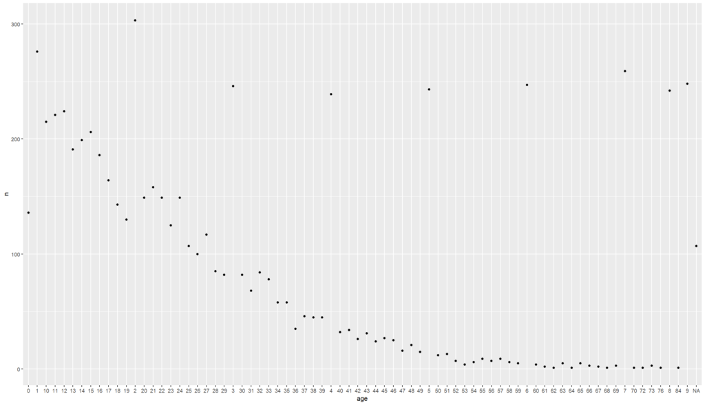
# what if you want to view this distribution separated by sex?

# first lets view how to assign colours

linelist%>%
  count(age)%>%
  ggplot() +
  geom_point(
    mapping = aes(x = age, y = n, color = 'red'))

# here we have assigned all our values to the same colour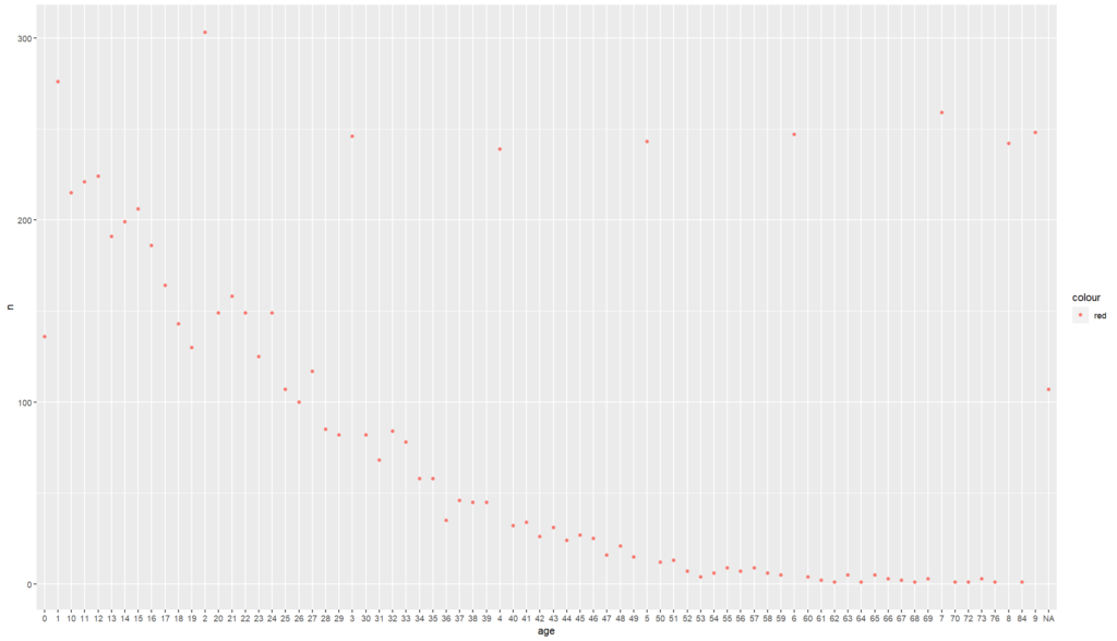
# what if we dictate colour using a value in our dataset
# let's say we want to view this distribution by gender

linelist%>%
  count(age, gender)%>%
  ggplot() +
  geom_point(
    mapping = aes(x = age, y = n, colour = gender)) + # here we ask R to assign colours
  # depending on the gender
  # our values to the same colour
  labs()+
  theme()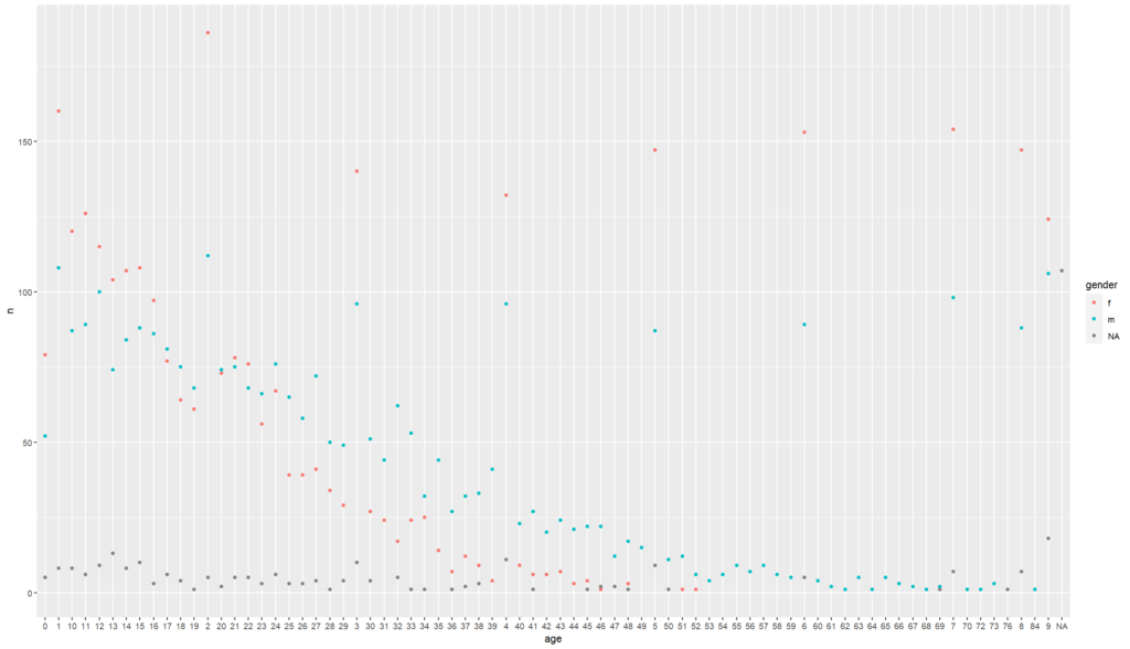
And that’s a wrap! Keep practicing 🙂 🙂

Responses